Articulate Storyline 360, ElevenLabs, Python, Freepik, Audacity. Published as a self-hosted web build.
The problem
Mark is good at his job. He knows the catalogue, he answers every question accurately,
and customers leave the showroom happy. They just don't come back.
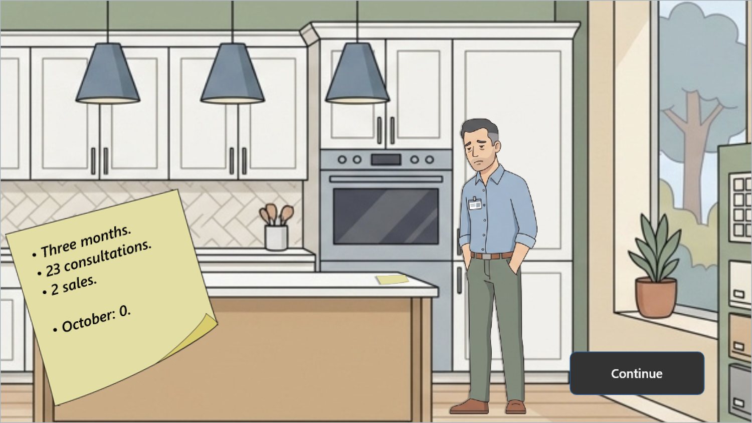
The opening screen of the course. The business problem stated before any training content appears.
Twenty-three consultations over three months produced two sales. Nothing in that number
points at product knowledge, and more product training would not have moved it. The gap
is in what happens in the first four minutes of a conversation.
A customer walks in and says "I need these cabinets, how long and how much."
That sentence is a request for information, and a well-trained salesperson answers it
well: six to eight weeks, twelve thousand and up. Accurate, helpful, and the end of the
conversation. What the sentence is not is the reason the person drove to a showroom on a
Saturday.
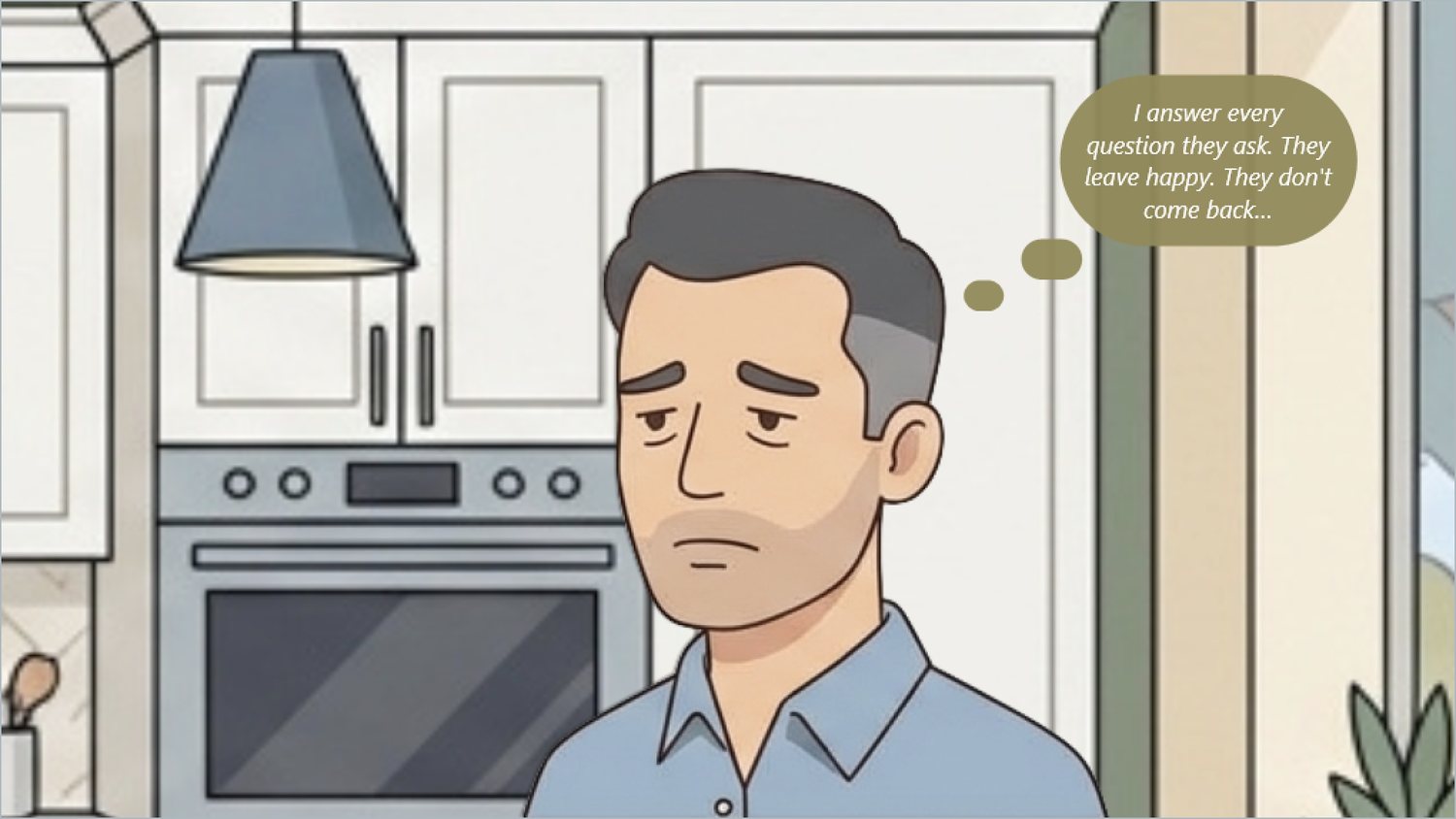
Mark's own diagnosis, from the intro. He is not failing at the job as he understands it — which is exactly why telling him to try harder would not help.
This is a behavior problem, not a knowledge problem, and the distinction decided the
whole design. People don't act on what they've been told; they act on what matters to
them. You can tell a salesperson that discovery questions improve close rates and he
will agree with you and keep quoting lead times, the same way a smoker agrees that
smoking is harmful. The only thing that changes the behavior is practising the
behavior, in a situation close enough to the real one that it transfers.
The solution
One shift in the showroom. Three customers. Each one says what they want and none of
them says why they came. The learner has to find out.
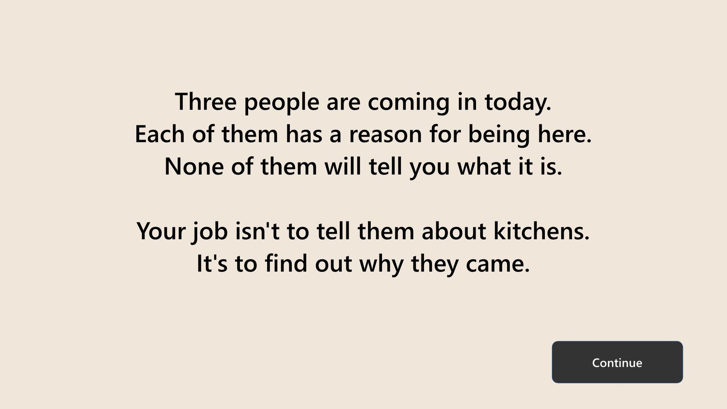
The entire instructional premise, stated once, in forty words, before the first customer walks in.
There is no lesson, no model to memorize, no list of discovery questions. The learner
plays Mark through fifteen decision points — five per customer. At each one the
customer has said something, and four possible replies sit on the screen. One of them
moves toward the real reason. The other three are things a competent salesperson would
plausibly say, and each of them gets its own answer from that customer.
I wrote the objectives against Bloom's taxonomy before designing anything, because the
level decides the format. Everything here sits at analysis and above, which is precisely
why a quiz could not have tested it. You cannot multiple-choice your way to "notice that
she is embarrassed about her kitchen"; you have to put the learner in the conversation
and let them miss it.
Learning objectives
Distinguish a customer's stated request from the motive behind it,
using evidence from what they say and how they behave.
Analyze
Evaluate four plausible responses and select the one that addresses
the motive rather than the stated request.
Evaluate
Apply the same approach to an unfamiliar customer whose situation
shares none of the surface details of the previous one.
Apply · transfer
The third one is why there are three customers and not one. Denise hides embarrassment,
Ray and Carol hide a disagreement, Tony hides his mother — if the learner could pass by
recognizing a pattern from the first conversation, the course would be testing memory
instead of judgement.
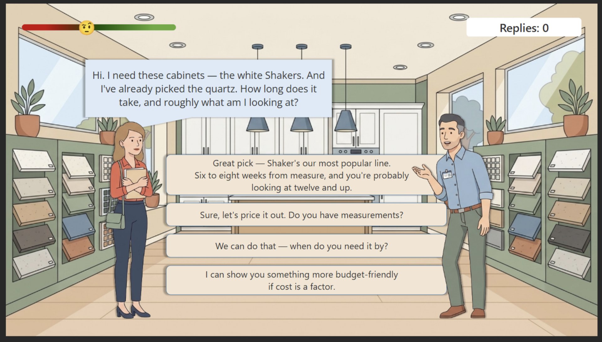
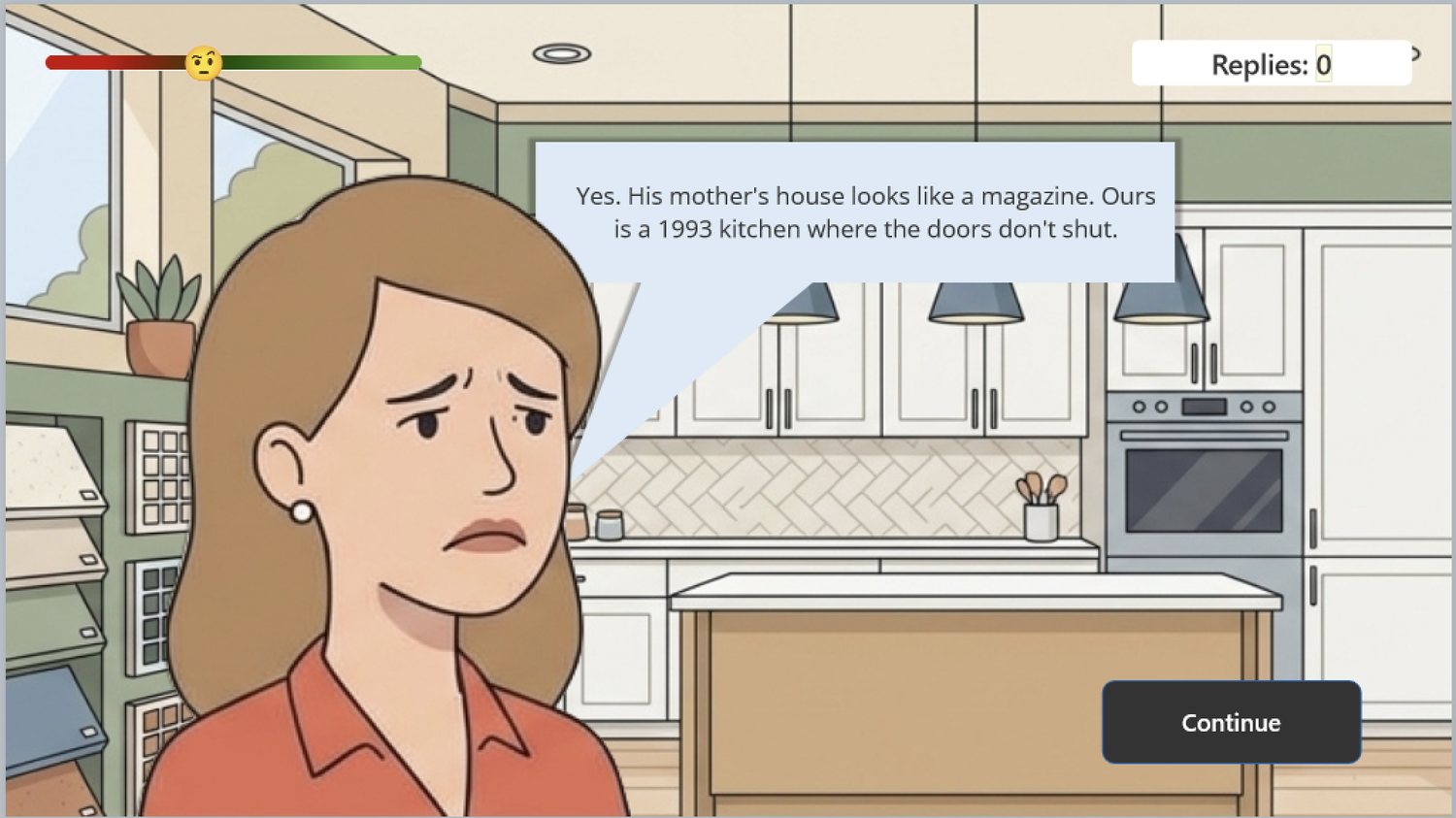
Denise came in for cabinets. Her daughter is getting married in April and the
reception is at her house, and her son-in-law's mother's kitchen looks like a
magazine. She will never say that to a salesperson. She says
"how long does it take and roughly what am I looking at."
The moment the course exists for. Four replies earlier, this woman was asking about quartz countertops.
My process
Ten days of a software trial, one person, no budget. That constraint set the order of
work: logic and a working branch first, graphics and polish after, and a publishable
link from day one so there would be something real at the end regardless.
Action mapping
I started from the business number and worked backward to behavior, then to
practice. Everything that didn't change a decision in the showroom got cut — which
is why the course contains no history of cabinet construction, no materials
glossary, and no model named after anyone.
The action map. The middle column is the course; the left column is why it exists and the right column is the only form of practice that teaches it.
Writing the conversations
The script came before anything was built, as a plain table: what the customer says,
what they are actually thinking, four possible replies, the weight of each, and the
customer's reaction to each. Writing it this way meant the hard work — making three
wrong answers that a real salesperson would genuinely choose — was done before a
single slide existed.
The wrong answers are the design. If they are obviously wrong, the learner pattern-matches
instead of thinking. So each distractor is something defensible: offering a cheaper
line when cost was never the issue, promising the timeline will be met, reassuring
someone that Shaker cabinets are a safe choice. All three are things that get said
in showrooms every day, and all three end the conversation.
The three customers also had to fail differently. Denise is embarrassed and will not
admit it. Ray and Carol disagree with each other and neither one has said the real
thing out loud. Tony is buying a forty-dollar faucet and the reason is his
eighty-three-year-old mother. One script pattern, three different ways of hiding.
Branching that never dead-ends
My first branching map punished a second wrong answer by ending the conversation:
the customer said "I'll think about it" and left, and the learner restarted that
customer from the beginning. It was a reasonable-looking rule and I cut it.
A learner who gets locked out stops trying. That is learned helplessness, and it is
the opposite of what a practice environment is for. The mistake was also already
punished three separate ways — the customer's mood drops, the reply counter climbs,
and the final star rating falls — so the ejection added a penalty on top of a
penalty and removed the learner from the only thing that teaches: the conversation.
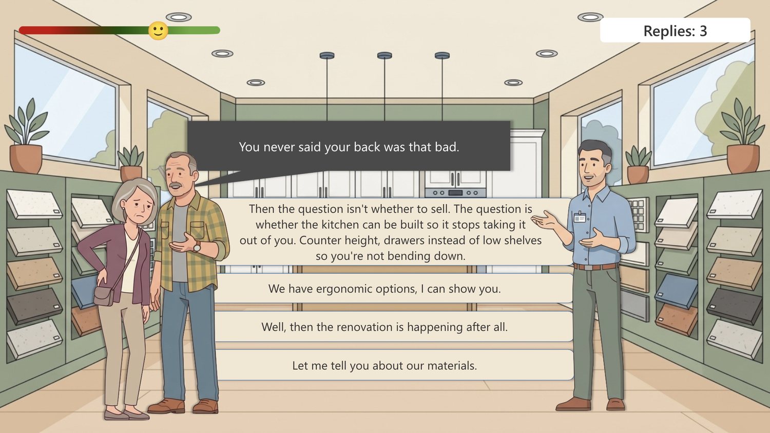
The rule I removed, and what replaced it. In v2 a mistake still costs — mood, a reply,
a star — but the conversation continues and the used option disappears, so the number
of replies spent is the score. There is no way to get stuck.
Then the harder half of the same problem
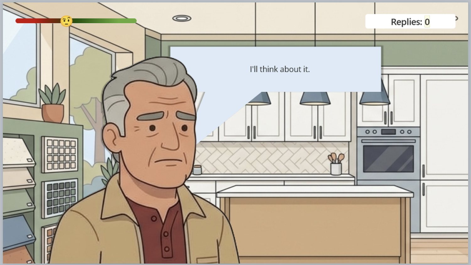
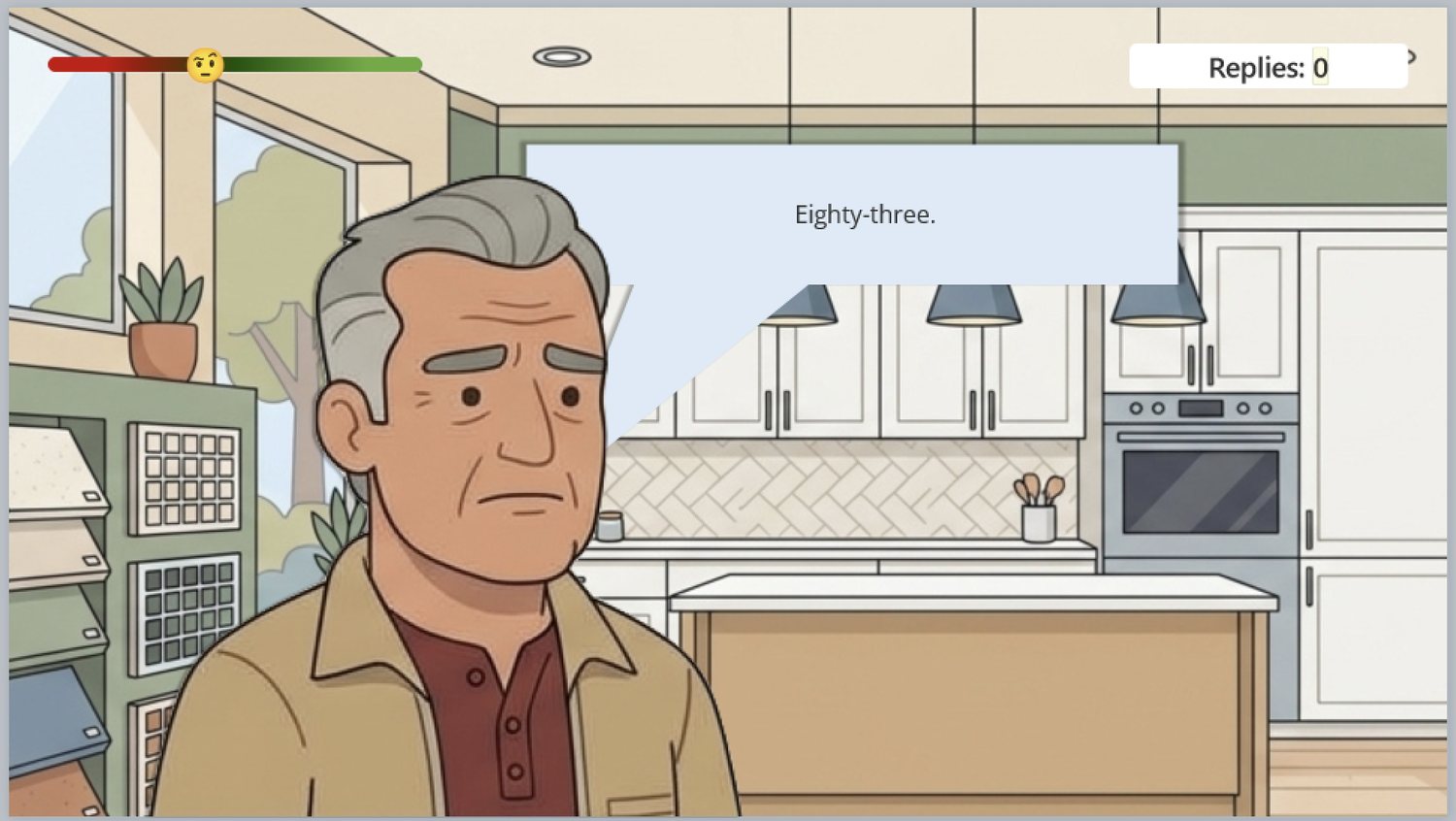
Running my own build of Tony's scene, I hit something worse than the fail rule. Mark
asks "How old is she?" — a decent question — and Tony replies
"I'll think about it." Every wrong answer on a screen shared one generic
brush-off line, so the dialogue read as nonsense.
BeforeOne brush-off line shared by every wrong reply on the screen.AfterTony answers the question that was actually asked.
Feedback has to be aware of what the learner said. Otherwise all they learn is
"that one wasn't it" — which is a quiz with better art, not a conversation. So every
wrong reply got its own answer in the customer's voice: forty-five of them across
fifteen screens.
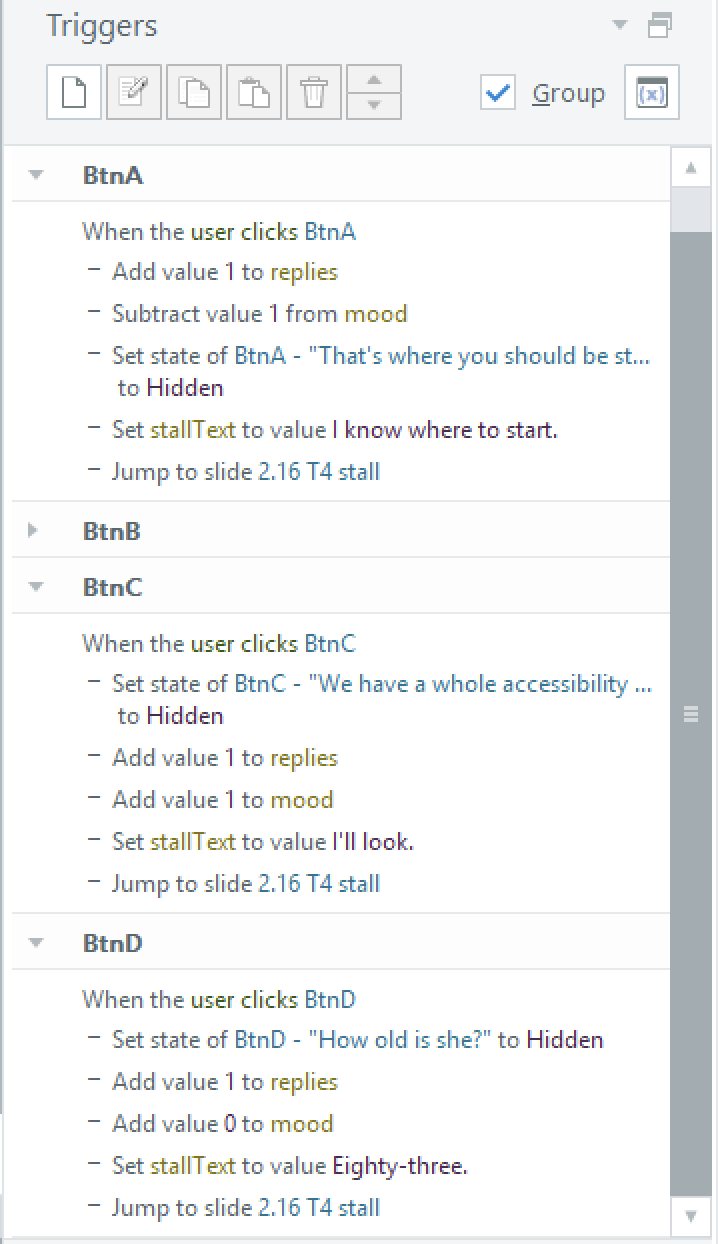
Forty-five lines did not mean forty-five new slides. Each wrong button now sets a
text variable before it jumps, and the single return slide displays that variable.
One extra trigger per button instead of thirty extra slides.
Three wrong buttons, three different lines, one destination. The rule I settled on:
variables where the content branches, static text on the slide where it doesn't.
Characters, shots and what the picture is doing
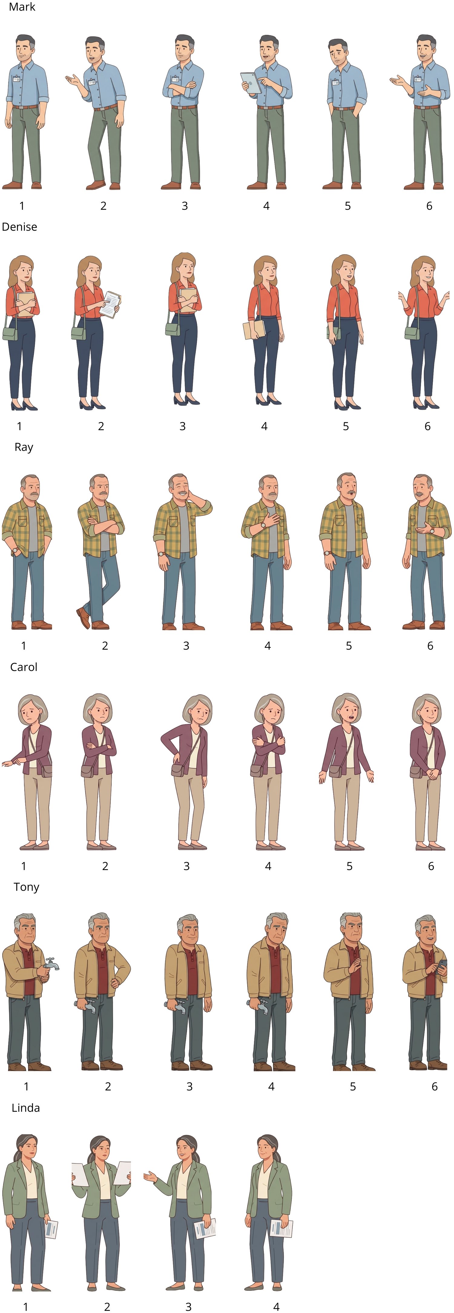
The learner's job is to read a person, so the people had to be readable. Each
character got a set of poses and expressions, and the arc of a conversation is
carried by which ones appear: Denise starts with a folder clamped to her chest,
holds up a printout while the talk is about cabinets, lowers the folder when the
real reason is named, and ends with open hands.
Six characters, six poses each. Scroll the panel. Expressions were drawn as a second set of eight per character and swapped as object states.
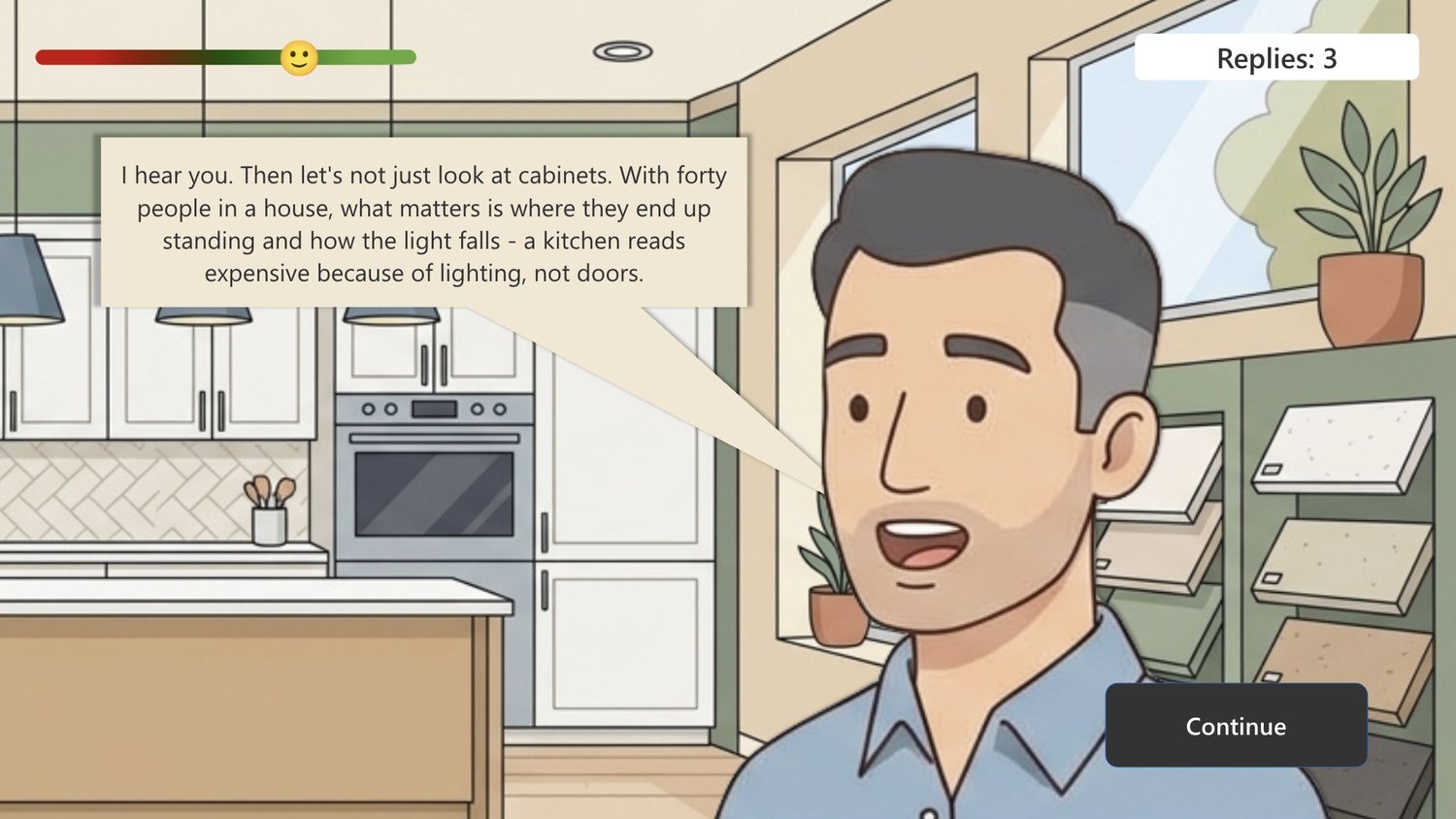
The scene is cut like film rather than laid out like a form. A customer enters in a
wide shot, speaks in close-up, and the choice is made in the wide shot where both
people are visible. The close-up is not decoration: it is where there is room for a
long line, and it is where the gap between what someone says and what they mean is
visible on a face.
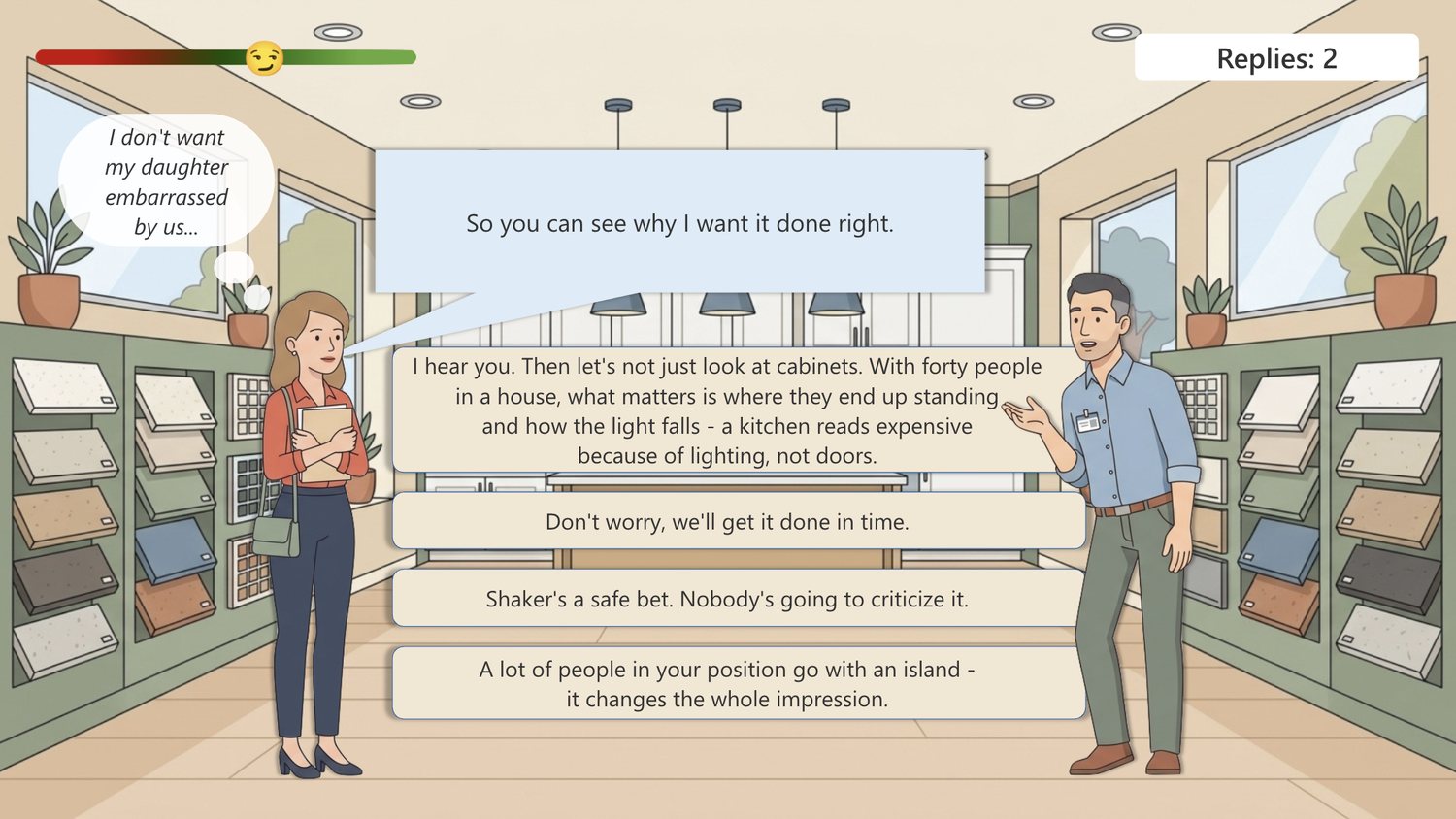
The thought bubble sits on the choice screen, where the decision is made — not after it.Mark's correct reply gets its own close-up, so the learner hears their own choice spoken.
Those thought bubbles appear only for the first customer, on three of her five
screens. It's deliberately fading support: with Denise the course shows the learner
what looking underneath the words means, and with Ray, Carol and Tony it stops
helping. By the third customer nobody is narrating the subtext.
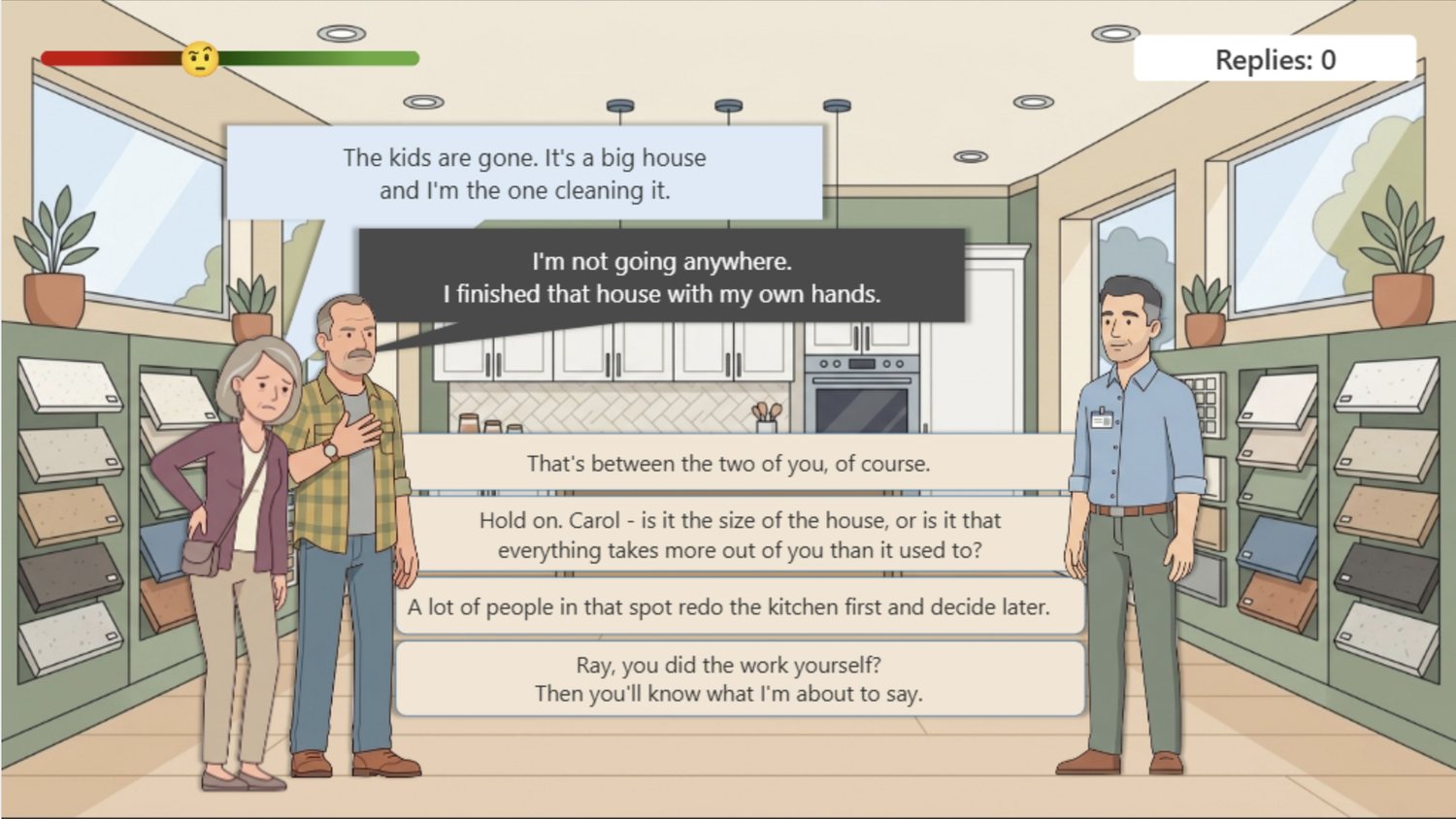
Two people in one scene created its own problem. Ray and Carol are a couple who
disagree, and the learner has to tell who is speaking without name tags. Carol always
stands on the left and Ray on the right, her bubble is blue and his is dark, and when
both speak her line sits above his so reading order matches speaking order.
Two speakers, no labels. Position and color do the attribution.Carol holds her lower back one screen before she admits anything. Ray only turns to look at her on the next one.
Building it
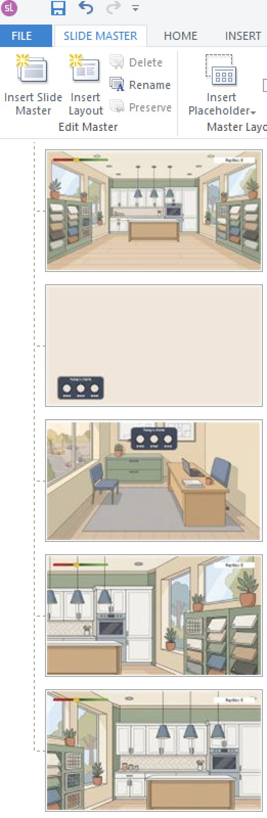
Five slide masters carry everything that repeats — the mood meter, the reply counter,
the progress panel — so a change to the interface happens once rather than
eighty-one times. Eighty-one slides, five scenes, named by customer and step
(D1 choice, D1 stall, R3 mark) because at that
count a mislabeled jump target is very hard to find.
Five masters. Shared interface lives here, not on the slides.Five scenes. Each customer was built by duplicating the previous one.
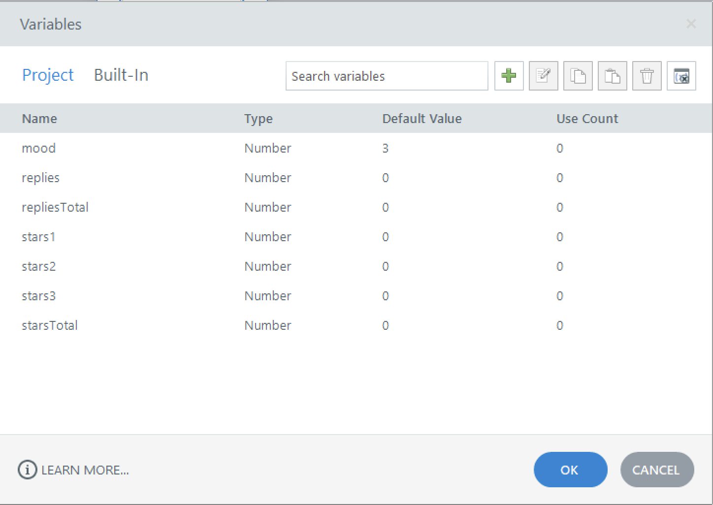
Eight variables run the whole thing: the customer's mood, replies spent on the
current customer and overall, a star score per customer, a total, and the text
variable that carries the right return line. By the end they were referenced about
five hundred times from triggers.
Day oneSeven variables, used zero times.Day eightEight variables, roughly five hundred references.
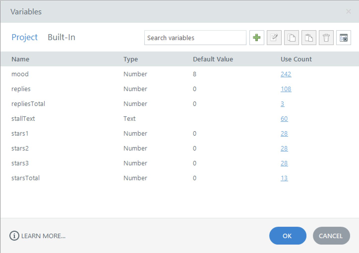
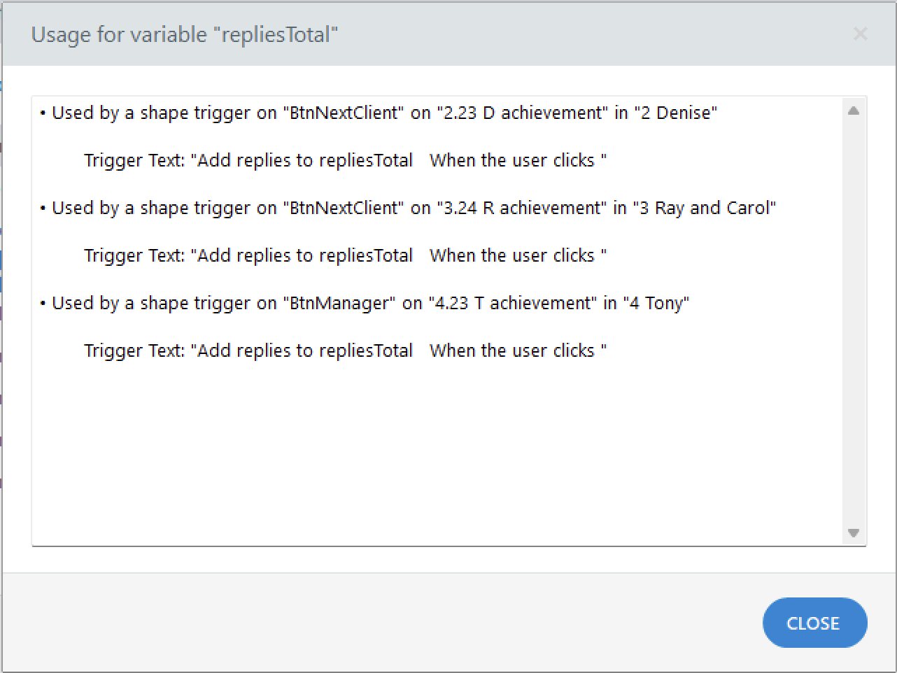
That use-count column turned out to be an audit tool. repliesTotal
showed 2 where it should have shown 3; one Add trigger had been deleted by
accident while cleaning up a button in Tony's scene. The Usage window named the
exact slide, which is considerably faster than replaying the course looking for a
number that is quietly wrong.
Finding a missing trigger by reading a count instead of replaying the course.
A scale that stopped responding
The mood meter originally ran 0–10, starting at 4, with a correct answer worth +2.
A perfect run hit the ceiling on the third of five screens and the face stopped
moving for the rest of the conversation — at exactly the point where Denise admits
she's ashamed of her kitchen, which is not a moment for a smiley face already pinned
at maximum.
I kept the weights, because four levels of answer (+2, +1, 0, −1) map to the model
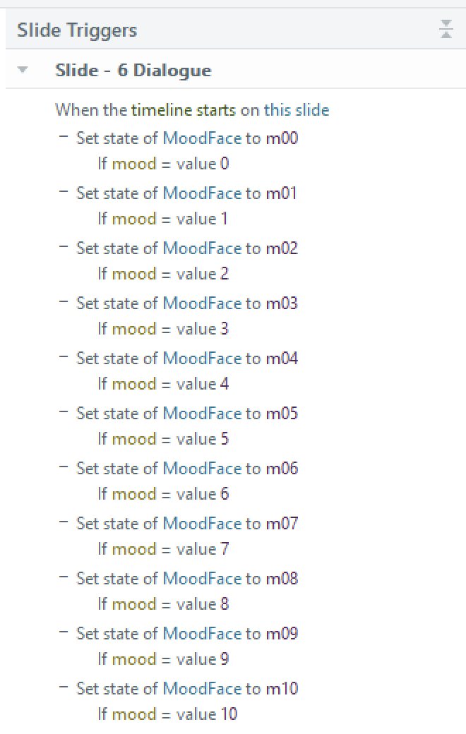
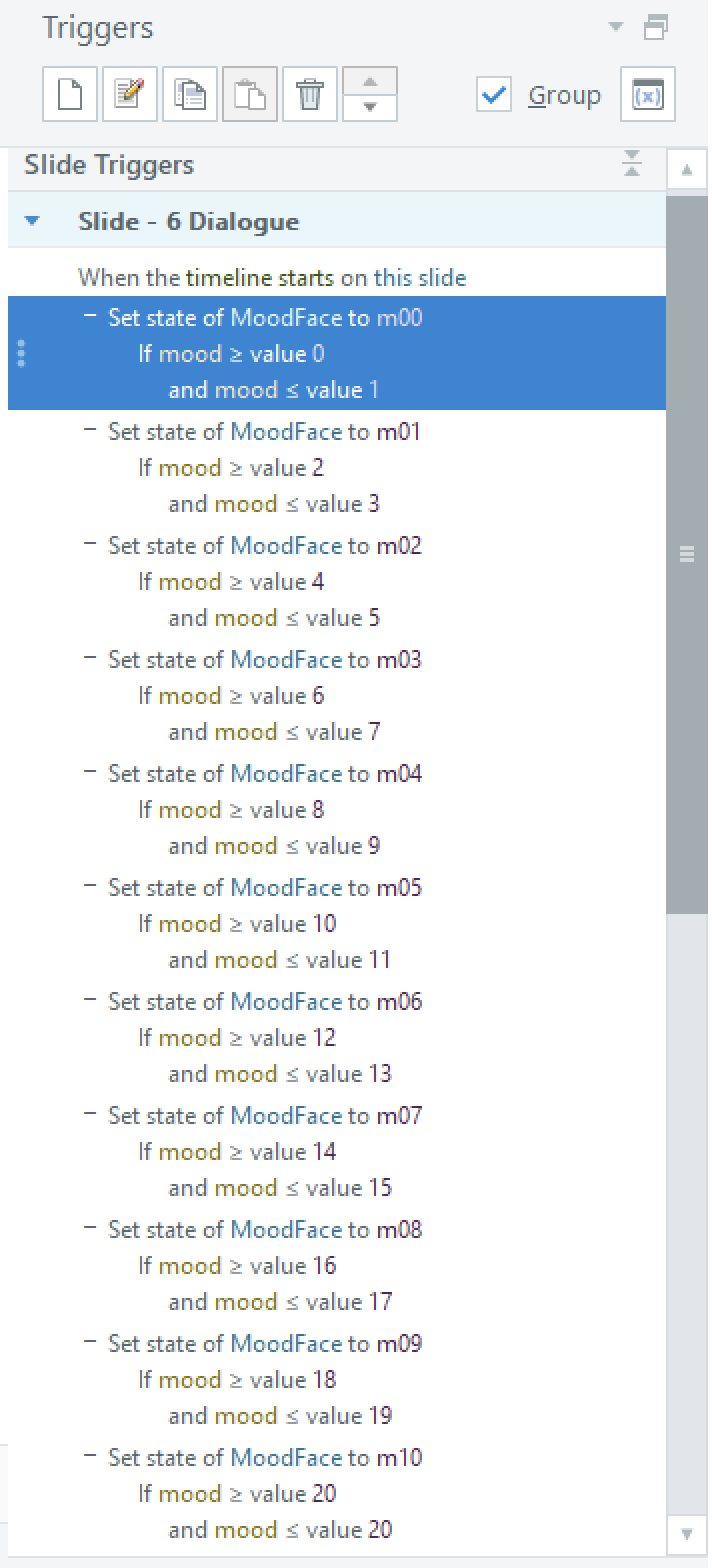
the course is built on, and doubled the range instead: 0–20, starting at 8, face
equals mood halved. The twenty-two expression triggers on the master changed from
equality tests to ranges.
BeforeOne face per value. Ceiling reached halfway through.AfterOne face per pair of values, so a perfect run still has headroom at the end.
The lesson cost me an hour of hunting: the same logic had been duplicated onto three
masters, and I fixed only one. The face behaved on the choice screens and jumped
around on the close-ups. If identical logic lives in more than one place, the list
of places is part of the build.
Voice
Without audio the course felt like a silent test. I tried Storyline's built-in
text-to-speech first and marked up two dozen lines with pauses and emphasis; it got
better and stayed flat. In a conversation that runs on embarrassment and a man's
mother, a level voice kills the scene.
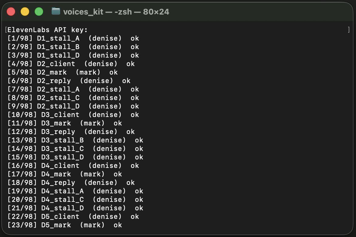
So: six voices through ElevenLabs, one per character, plus a seventh narrator who is
not one of them. Emotion is set by a tag before each line, and the tags follow the
course's own logic rather than taste — a return line is tagged by the weight of the
answer that triggered it. Pick something careless and the customer sounds annoyed;
pick something merely unhelpful and they sound unconvinced. The feedback is in the
voice, not only in the text.
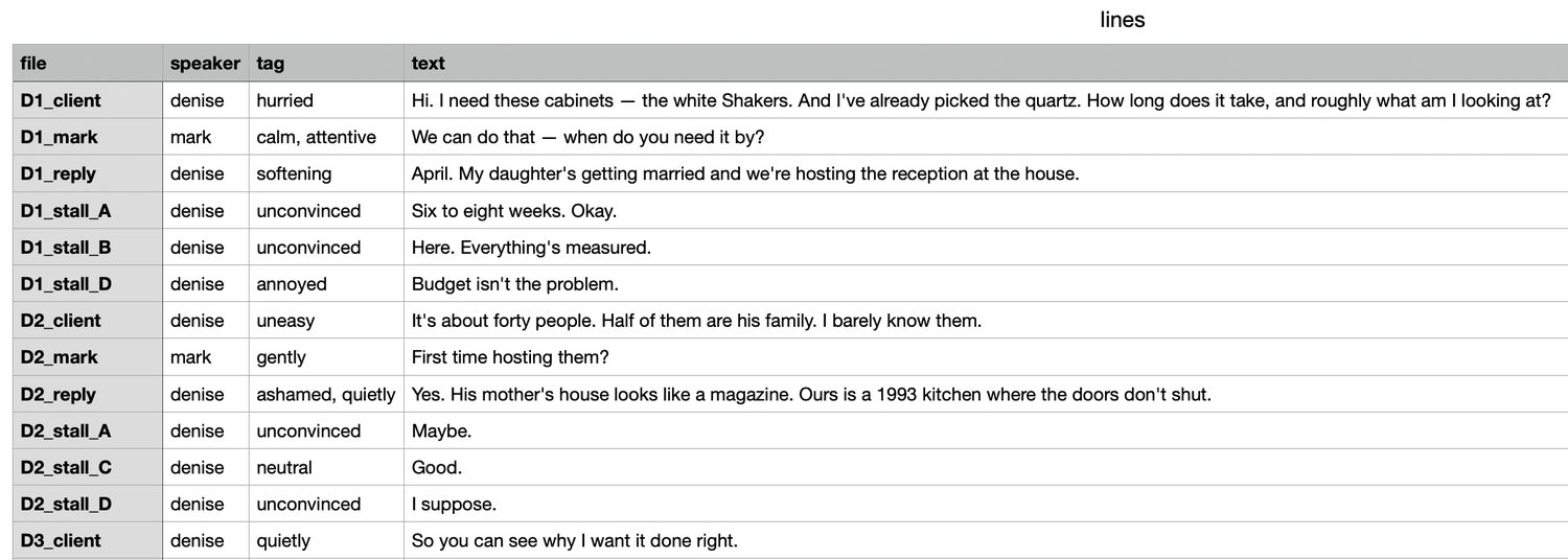
One table: file name, speaker, emotion tag, line. Ninety-eight rows.A Python script turns the table into MP3s named after the slides. Re-running it only generates what's missing.
Naming each file after its slide meant importing ninety-eight clips without checking
a single one against a list. Re-recording a bad take is deleting one MP3 and running
the script again.
How the learner knows how they did
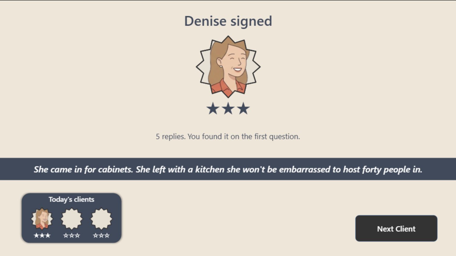
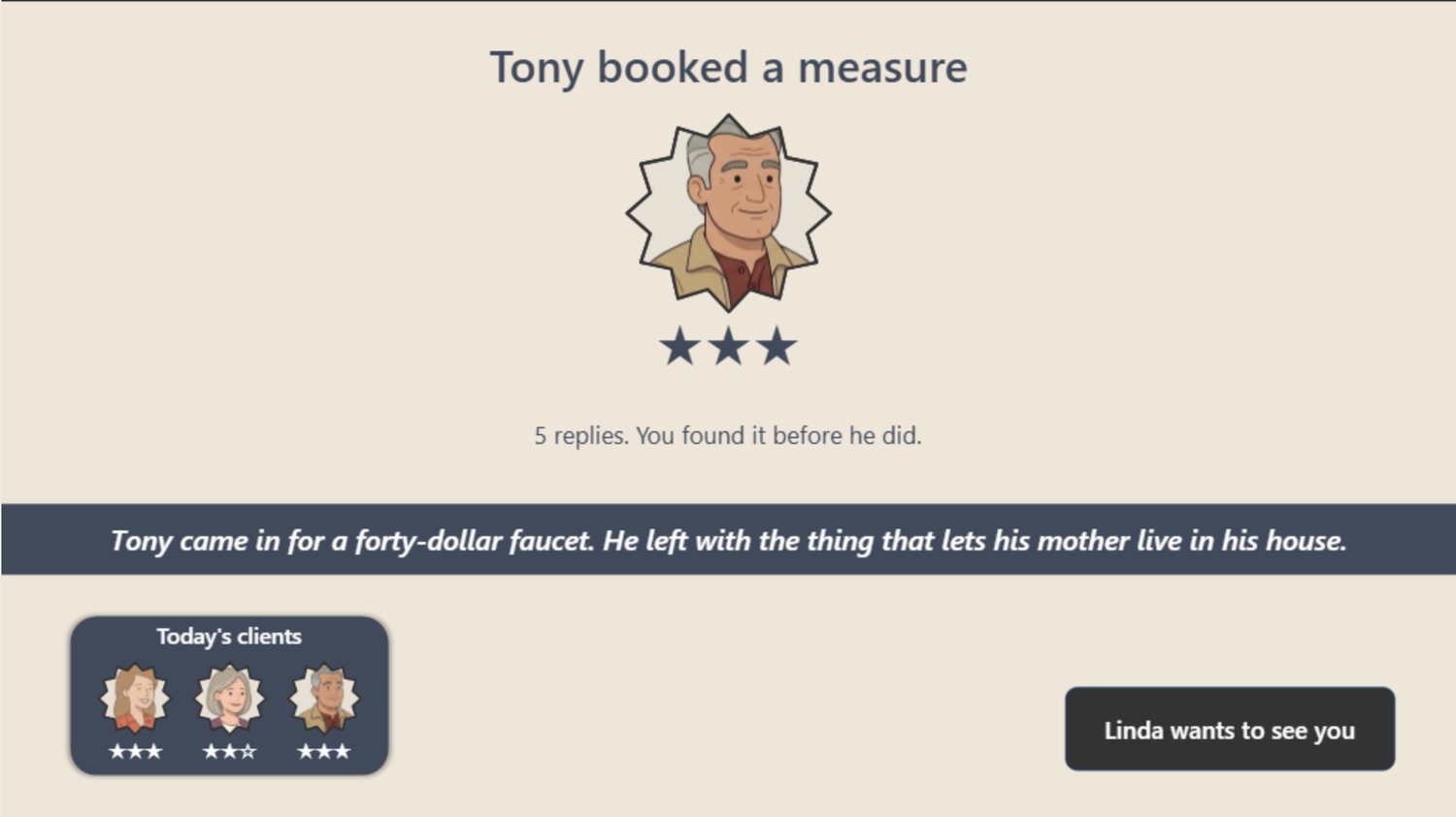
Each customer ends with a result screen: the star rating, the exact number of replies it
took, and one line that names what actually happened in that conversation. The
scoring is simply efficiency — five replies is the minimum, so five replies is three
stars.
The line under the stars restates the whole point of the exercise.The day's progress panel fills up as customers are closed.
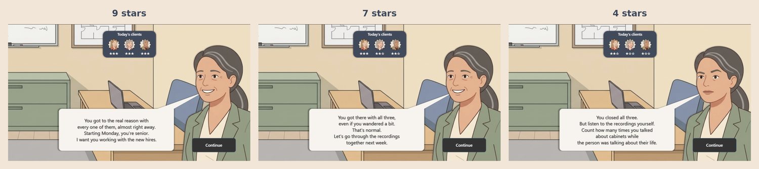
The shift ends in the manager's office. Linda has three things she might say, chosen by
the total across all three customers — and the weakest ending is the most useful one.
Nine stars: a promotion. Seven: let's review the recordings together. Four: you closed
all three, now count how many times you talked about cabinets while the person was
talking about their life.
Then the model, once, at the very end — never before. The learner has already spent
twenty minutes discovering that arguments move people less than motives do. Naming it
first would have turned the experience into an illustration of a lecture.
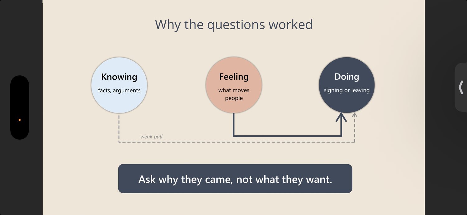
The closing screen, on a phone. Knowing pulls weakly at Doing; Feeling pulls hard.
That is also the course's own scoring: an argument is worth +1, reaching the real
reason is worth +2.
81slides
8variables, ~500 references
45written consequences
98voiced lines
Results, and what I'd actually measure
This is a portfolio project. No one has run a sales team through it, so I am not going
to claim a lift in close rates. What I can say is what the build produced and what I
would put in place on day one of a real rollout.
The whole thing — fifteen branching decision points, three complete conversations, three
endings and a working published link — took four days of build inside a
ten-day software trial, with voice and polish added after. It runs in a browser on
desktop, tablet and phone, with no LMS.
If this were deployed, here is what I'd instrument, against Kirkpatrick's four levels.
Most training programs stop measuring at level 1, which is why so many of them
survive without ever proving anything.
Level 1 · Reaction — one question at the end: would you use this
with a customer on Monday? Anything else is a satisfaction survey.
Level 2 · Learning — the course already measures it. Replies spent
per customer is a clean efficiency score, and it's stored in a variable. Push it as
xAPI and you have per-learner data on where people wander.
Level 3 · Behavior — the thing that matters. Manager-scored call
reviews on one question: did the salesperson ask about the person before talking about
the product? Baseline before, repeat at thirty days.
Level 4 · Results — consultation-to-sale rate by salesperson, which
the business already tracks, compared against when each person took the course.
Levels 3 and 4 are the only ones that answer the question the business asked, and
neither of them can be collected inside the course. That has to be agreed with whoever
owns the sales numbers before the first slide is built, which is a conversation I'd have
at the start of a real engagement rather than at the end.
What I'd do differently
Two things. The first screen I built was the one where the mechanics were still being
worked out, and it quietly kept a bug the later screens didn't have — I should have
rebuilt it from the finished template rather than patching it. And I would write the
return lines at the same time as the options, not after: separating them is what
produced a customer who answered a question nobody asked.
See it for yourself
Twenty minutes, three customers, no login. The fastest way to understand the design is
to pick the wrong answer on purpose and watch what the customer does with it.